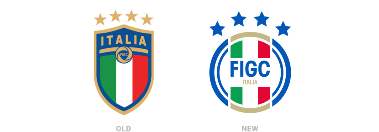
Download FIGC Italy logo 2021
 The “Federazione Italiana Giuoco Calcio” (Italian Federation of the Game of Soccer) was established in Turin in 1898; its existence contributed to make soccer the most important national trend. The debut of the national team is dated back to 1910 in the Arena di Milano, with a white uniform (Italy-France 6-2); nowadays the reasons behind the choice of a white uniform are still unclear; some claim it was due to economic reasons, some other intend it as a tribute to the best Italian team at the time, the Pro Vercelli. The following year, against Hungry, the light blue t-shirt was first used, as a tribute to the banner of the Royal Family, the Savoia, which consists of a red symbol on a white cross on a light blue background. During the twenty years of Fascism, the symbol of the Savoia family acquired the crown and the fasces. With such uniforms the “azzurri” won two world cups (1934 and 1938) and a gold medal at the Olympics (1936), under the coaching of Vittorio Pozzo. In the post-war period soccer represented one of the elements which helped our country to recover; the tricolour replaced the Savoia symbol on the chest of the uniforms. In 1952 there will be an utter modification to the tricolour: on top, a golden rectangle with the word ITALIA. After years of disappointment, finally two bright pages in the history of our national team: the European title won in Italy (1968) and the second place reached in Mexico(1970), valued even more due to the epic semi-final Italy-Germany (4-3). The players dressed a fairly minimalistic uniform which, along with the one from 1982, is the most remembered one, and represents THE uniform. In 1974 yet one more restyling: a rhomboid containing the tricolour, a yellow soccer ball and the acronym stationed in a circular fashion; in some cases the rhomboid was inscribed in a square, with the letters forming the acronym placed at the four corners. In 1982, year in which the World cup has been held in Spain, a small modification to the title was made: the acronym FIGC was added vertically inside the white stripe of the tricolour. In 1984 a new round logo substitutes the previous title-shaped; inside appear the three golden stars on light blue background, the text “Italia” and “FIGC” and the tricolour placed diagonally. Also the materials used change: from the wool-like fabric, to an acetate and lucid one. In 1992 the Federazione proclaimed open a contest for the new logo: the winner was Patrizia Pattacini, with a simplified “I” with the blue dot up on the left; in the upper part there are the three stars on light blue background, in the centre the complete denomination of the Federazione and in the lower part the tricolour, now reduced to the minimum compared to its importance when the logo still featured the Savoia symbol. In 2000 the tricolour title is back, after being introduced for the first time in the fifties. It now features, for the first time, the three golden stars where there used to be the text “Italia” while the acronym disappears. The stars appear after the FIFA allowed, in the second half of the nineties, to show on the uniform as many stars as many championships won. In 2006 the logo changes again, so to remind the original title, even though modernized and evolved accordingly to the new trends: a more neat and clean shape with the tricolour on light blue background, a circular sign standing for FIGC on the white stripe and the three stars. In 2007, after winning its fourth world cup in Germany, the logo undergoes a compulsory restyling: the adding of the fourth golden star and the circular sign increased in size so to gain more importance in the composition. In 2017, Federcalcio, in order to combine tradition and modernity, has a new shielded logo above which the four stars of the world triumphs are most visible, pride throughout the country. The word “Italy” stands on the tricolor above a curved horizon.


دیدگاه خود را ثبت کنید
تمایل دارید در گفتگوها شرکت کنید؟در گفتگو ها شرکت کنید.